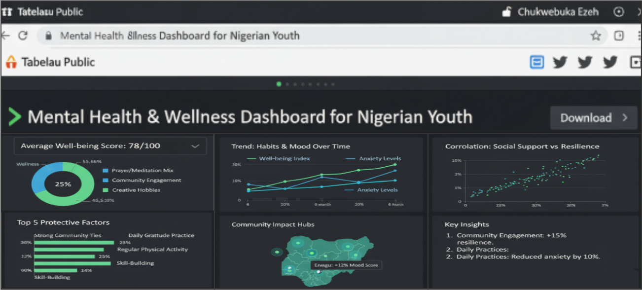
The final dashboard, designed to make complex data accessible and engaging.
Finding the Human Story in Data
As a Health Psychology student and a Data Analyst, I am constantly driven by the question: how can we use data to better understand and improve the human condition? In Nigeria, where conversations around mental health are becoming increasingly vital, I saw an opportunity to move beyond anecdotal evidence and explore the tangible links between our daily habits and our psychological well-being.
This led me to create the Mental Health & Wellness Dashboard, an interactive project using Tableau. My goal was to transform raw survey data into a clear, visual story that could empower individuals, community leaders, and mental health advocates with actionable insights.
From Numbers to Narrative
The primary objective was to analyze anonymized survey data to identify correlations between specific wellness habits (including exercise, community engagement, and faith-based practices) and self-reported mental health scores among Nigerian youth. The project aimed to:
- Quantify the Impact: Provide a statistical foundation for wellness strategies.
- Democratize Insights: Present findings in an interactive format that anyone, regardless of their technical background, could explore.
- Inform Action: Offer evidence that could help shape community-based mental health and wellness programs.
My Methodology and Tools
I managed the entire data lifecycle for this project, from conception to final visualization.
- Data Collection & Preparation: Anonymized data was gathered through a structured survey. I then used Microsoft Excel and SPSS for meticulous data cleaning, handling missing values, and preparing the dataset for analysis.
- Statistical Analysis: To uncover underlying patterns and test for significant correlations, I utilized SPSS, drawing on my background in quantitative psychological research.
- Data Visualization: The heart of the project is the visualization. I used Tableau to build the interactive dashboard, focusing on a clean design, intuitive filters, and compelling visual storytelling to make the insights immediately clear.
Key Findings Visualized
The dashboard brings several key insights to life. For instance, users can visually explore the strong inverse correlation between regular community engagement and reported feelings of anxiety. Another compelling visualization shows how consistent reflective practices, like journaling or prayer, link to higher scores on a self-reported resilience scale. These are not just statistics; they are visual confirmations of the power of community and mindfulness.
A Tool for Change
This dashboard is designed to be more than just a portfolio piece; it's a tool for conversation and change. It provides a data-driven starting point for NGOs, faith-based organizations, and educational institutions to discuss and implement wellness initiatives that are grounded in evidence. By visualizing what works, we can better support the mental health of our youth.
I'm Chukwuebuka Samson Ezeh, a Data Analyst and Health Psychology Researcher. Discover more of my work at the intersection of data, health, and technology on my portfolio website.